 Home Page

14 December 2023 / 21:35
Today, mobile devices have surpassed desktop computers in accessing the internet. Therefore, making a website mobile-friendly is a critical factor in user experience and success. In this article, we will explore the importance of mobile-friendly web design and the strategies that can be used to maximize user experience.
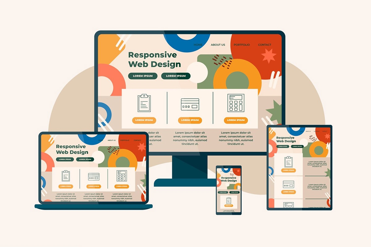
1. Use Responsive Design
Responsive design is a strategy that allows your website to automatically adapt to different screen sizes. This allows users to browse comfortably on both desktop computers and mobile devices.
2. Optimize for Fast Loading Times
Mobile users are often impatient. Therefore, it is important that your website loads fast. Compress images, reduce unnecessary elements, and keep page load times to a minimum.
3. Add User-Friendly Controls for Touch Screens
Mobile devices are often used with touch screens. Therefore, adding convenient controls to touchscreens for navigation and interaction is an important way to improve user experience.
4. Implement Mobile SEO Strategies
Google and other search engines give priority to mobile-friendly websites. By using mobile SEO strategies, you can ensure that your website ranks higher in search results.
5. Deliver Visually Optimized and Readable Content
Mobile users usually visit for short periods of time, so your content should be short, concise and understandable. Also, make sure users consume your content easily by using large, readable fonts.
6. Collect Testing and Feedback
Check your website's mobile compatibility by running regular tests on different mobile devices and browsers. Gather user feedback and make improvements based on that feedback.
Conclusion
Mobile-friendly web design is critical not only for user experience but also for search engine rankings. Responsive design, fast load times, touchscreen compatibility and user-friendly content are key to providing a positive experience for mobile users. By adopting these strategies, you can ensure that your website is successful on mobile platforms.